Brooklyn Public Library
Brooklyn Public Library website redesign
My Role: UX Researcher | Duration: 2Weeks | Project Status: Ongoing
Project Overview
The Brooklyn Public Library is one of three separate and independent public library systems in New York City. It serves at least to 2.6 million residents in Brooklyn alone. Despite the large number of residents that the library services, the navigational structure of the Brooklyn Public Library’s website needs a full upgrade. Our user persona, Priya, states “I want to access the world’s wisdom through learning.” We can account that she may not be able to access the world’s wisdom through learning if she relies on the information from the Brooklyn Public Library’s website alone. In order to fully understand the business, our team performed multiple research techniques such as Tree Testing, Card Sorting, a Business Model Canvas, Competitive and Comparative Analyses and Heuristic Evaluation to discover ways to improve the home page of the Brooklyn Public Library.
Goal
To redesign the information architecture of BPL existing website.
Methodology
To carry out this research we
- Created a Business model canvas
- Competitive & Comparative Matrix
- Heuristic evaluation
- 2 Tree tests
- 1 Open Card Sort
- 2 Closed card sortSynthesis
To understand more about the users and BPL itself .
Persona
Our redesign was focused on Priya, she was important for our design process and which areas to focus.
Priyas Goals were to
Easily find a book or journal that interests her.
To keep up with the latest titles in her favourite genere.
She needs the ability to filter and add keywords to narrow down searches.

Revised Problem Statement
Even though our first hypothesis was invalid we ended up discovering new trends that guide us to find a new one, that set the direction for our new hypothesis.
How might we provide users with a space where they can find people with the same professions, connect with and learn from?
INSIGHT: We found out that “people like to learn new stuff from the new people they follow”.
PERSONA: Artist/ Graphic designers.
PROBLEM: People find it hard to find other poeple that actually they can learn something from.
GOAL: Space for knowledge.
Business Model Canvas
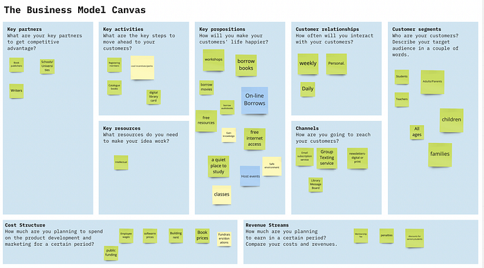
Our team completed a Business Model Canvas to get a full understanding of The Brooklyn Public Library. We learned that it is an independent, nonprofit public library system. The library provides products to borrow for free such as books, eBooks, audiobooks, publications, music, movies, and other content. The library hosts classes and workshops for people of all ages. Additionally, it’s a public place with free access to wifi, and provides space for people to interact around information. The library is funded by New York City, New York State, fundraisers, a shop, and also accepts donations. The business model follows a B2C or business to consumer model.

Competitive Matrix
Despite the fact that the Brooklyn Public Library is an independent non-profit entity they do compete with some of the top literary profit based companies in the world. In choosing our competitors for the Brooklyn Public Library we based our research on 4 factors: membership, physical, on-line, and one-time purchase companies. Each of these companies listed below provides at least one feature service similar to the Brooklyn Public Library

Feature Analysis
We perform a competitive analysis to identify opportunities and thus be able to find elements that are functional for the user or that have been proven to be elements that work today. In order to know more about our competition, we created a competitive and comparative table.
The second competitive analysis we carried out was a table where we compared the companies that were competing for our client, and we evaluated what elements they had that the brooklyn public library did not have or in some cases that they shared.
In the second table we evaluate the characteristics of the companies that had a similar function to the Brooklyn public library and thus, what elements they shared and which others did not.

Heuristic Evaluation
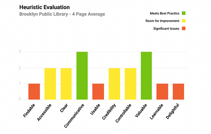
We have completed a heuristic evaluation for The Brooklyn Public Library website in order to identify usability problems within the information architecture. Specifically, we used the “Abby Method” as a checklist to critique the design of four high-traffic pages from the library’s website. The following chart is a summary of those four, and scores each heuristic technique on the following: if it has significant issues, needs improving, or meets best practices.In order to find new findings, we did 5 interviews of approximately 10 minutes each.

Tree test
Tree Study Results
Overview
We have evaluated the existing navigational structure of The Brooklyn Public Library’s desktop website in order to discover areas that need improvement. Users were tested on their ability to complete three tasks. These results gave us insights into how well users are responding to the site’s current taxonomy.
Methodology
The team conducted a remote tree test with twelve participants using Optimal Workshop. Each participant was given a link to the test. They were given a basic, text-only navigational structure along with three tasks to complete, one at a time.
Task 1 — Reasoning
Based on our persona Priya, this task was given to see if she could find a physical book in a specific genre of her choosing.
Scenario and Task
Unfortunately the weather man just announced that there will be snow on the horizon in the next few days. You have decided to pick out a physical book from The Brooklyn Public Library to read while snowed in- preferably a new mystery.
The average time on task was 33.26 seconds. Based on the following paths the users took, 83% of users correctly clicked the first four paths, and only 33% of users were successful completing this task- however all successful participants took a direct path. 58% of unsuccessful participants were a direct failure
Open Card
Overview
Based on the current navigational structure of the Brooklyn Public LIbrary website we have noticed many revisions that should be updated to acquire a better user-experience. We asked users to label and locate their own categories and from these observations to find areas for improvement.
Methodology
The team conducted an open card sort test on five users using the Optimal Workshop application. Each user was given the option to determine based on their own intuitive reasoning where they would label and locate categories on the Brooklyn Public Library website.
Reasoning
This task was given to each user because we wanted to see how they would create and label their own groups based on the number of cards offered to them through our testing module.
Closed Card
We made an evaluation of the navigation structure of the Brooklyn Public Library’s website in order to evaluate how easy it is for the user to navigate with the predetermined categories, and from these observations to find areas for improvement.
Based on the results you can observe *below you can notice that:
For the Borrow category 48.57% of users classified the default labels the way the library page has them organized, While 51.43% of users accommodated them in one of the other categories.
For the Learn category we observe that 51.43% % of users classified the default labels outside the correct category and 48.57% classified them inside the correct category.
Attend was the category with more users accommodating the labels in different categories with 62.50% more than half of the users
On the other hand, More was the one that obtained the21
Attend was the category with more users accommodating the labels in different categories with 62.50% more than half of the users
On the other hand, More was the one that obtained the best results, with a total of 51.43%, more than half of the users classified the labels with the default classification of the library.
In conclusion we can say that there is confusion with users when knowing which label goes in which category, This is where we find areas for improvement, and thanks to this test we can now locate the areas the Brooklyn Library information architecture needs solving.
Revised Problem Statement
How might we provide Priya a more accessible way to find and filter her search via the library website?
Closed Card Sort proposed NAV.
Overview
We made an evaluation of the navigation structure of the Brooklyn Public Library’s website in order to evaluate how easy it is for the user to navigate with the new categories, and from these observations to find areas for improvement.
Methodology
The team conducted a Closed Card Sort test using Optimal Workshop, The study was carried out by 6 people. The purpose of this test was to evaluate the information architecture of Brooklyns Public Library site wirh the new categories.
Reasoning
This test helped us understand the user expectations and how the users classified the items in each predetermined category.
Takeaways
Based on the results you can observe *below you can notice that:
For the Books & Media category 39.58% of users classified the default labels INSIDE While 60.52% of users accommodated them in one of the other categories.
For the Online Learning we observed that 60.42% of users classified the default labels outside the correct category and 39.47% classified them inside the correct category.
BPL Programs was the category with more users accommodating the labels INSIDE with 62.50% more than half of the users while just 31.95% was outside.
BPL Services was the category with more users accommodating the labels in outside the cortrect category with 98% just 1% of the users had it correct.
On the other hand, About BPL just got 39.58% of the users categorizing the labels Inside. While the other 60.52% put them outside.
In conclusion, we can see that despite the changes made, users continue to have confusion where they could categorize the labels, but we can also see that in the case of some categories there was an improvement in the result, such as that of BPL programs that previously was called Attend.
Existing Site Map

The way I saw that this map was organized was the following, below primary are the categories of Borrow, Learn attend and more. Within the Borrow category, although it seems that borrow is the one that encompasses the others, it is not, in fact if we look at the URL of the page we can see that it was under the category of catalog, where iBooks, ebooks, audiobooks, music & recordings comefrom, as the secondary navigation. Learn is a primary category followed by kids, teens & young adults, parents, adults, and immigrants as a secondary. On the other hand Attend, which is a primary category, does not encompass the other categories that we can see within the library page, this is because if you go and look the URL it takes you to another page. But if you look at events and classes and all of the secondary categories you can see that they are under the same URL. It happens the exact same thing with more, all of them take you to diffrent pages thats why I ordered them outside under no primary categories.
User Flow

2º Tree Test
Ovierview
We made an evaluation of the navigation structure of the Brooklyn Public Library’s website in order to evaluate how easy it is for the user to navigate with the new proposed categories to observe certain and to be able to have a better idea of where the problem is.
Methodology
We carried out a second tree testing study through the optimal workshop, where a total of 21 people participated. This type of test is done to understand if an activity is easy (direct) or difficult (indirect), in order to evaluate this, certain scenarios are created and the user who is doing this test is asked to continue the activity, the results They are measured at the speed with which the participant can complete the activity and if there are errors.
Reasoning
This test does not help to solve the problem or problems that the user encounters when moving within the library’s website and thus being able to identify strengths and weaknesses.
Takeaways
The average time on task was 22.02 seconds. Based on the following paths the users took, 67% of users correctly clicked the first four paths, and only 67% of users were successful completing this task- however all successful participants took a direct path. 13% of unsuccessful participants were a direct failure
Task 1 — Reasoning
This task was given with an assumption that finding a book under the category of Books.
Scenario and Task
Unfortunately the weather man just announced that there will be snow on the horizon in the next few days. You have decided to pick out a physical book from The Brooklyn Public Library to read while snowed in- preferably a new mystery.
Task 2
The latest literary journals are now available at the Brooklyn Public Library. You have decided to browse newly published online journals about political science.
Task 3
Each of your desired physical books are unavailable at The Brooklyn Public Library. You have decided to see what’s available for e-books.
Proposed Site map

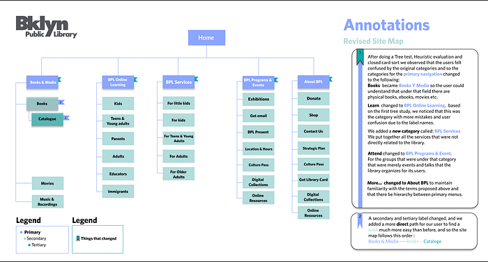
Books became Books Y Media so the user could understand that under that field there are physical books, ebooks, movies etc.
Learn changed to BPL Online Learning, based on the first tree study, we noticed that this was the category with more mistakes and user confusion due to the label names. We added a new category called: BPL Services We put together all the services that were not directly related to the library.
Attend changed to BPL Programs & Event.
For the groups that were under that category that were merely events and talks that the library organizes for its users.
More… changed to About BPL to maintain familiarity with the terms proposed above and that there be hierarchy between primary menus. A secondary and tertiary label changed, and we added a more direct path for our user to find a book much more easy than before, and so the site map follows this order :
Books & Media — — -Books — -Cataloge
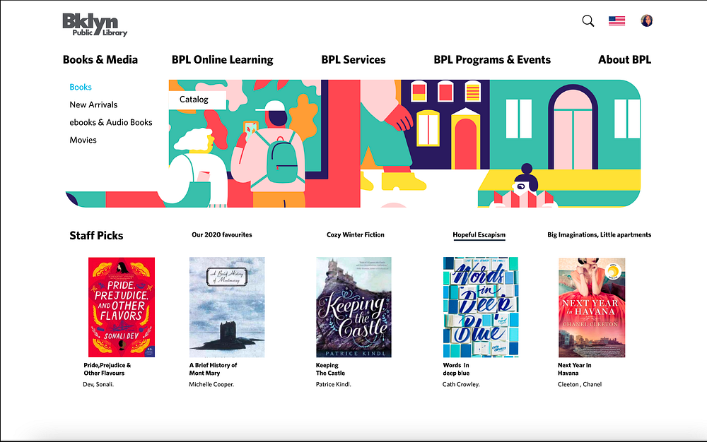
Proposed Design

